Sloan-o-graph
As I watched Sloan take the stage last week at the Rickshaw Stop and launch into Andrew’s 18-minute-long “Forty-Eight Portraits”, three lines of thought came to mind:
- I’ve been a Sloan fan for over 20 years now? Really?
- This is my, what, tenth time seeing them live? Seriously?
- How come Jay doesn’t sing backup when he switches onto the bass? Actually, on which songs does he sing backup? How often do those two interact anyway? What about Patrick and Andrew?
On a lark, I decided to build a one-off web app to help answer these vital questions. So, here we have it: the sloan-o-graph. Here’s a non-interactive screenshot in case you’re too lazy to click through:
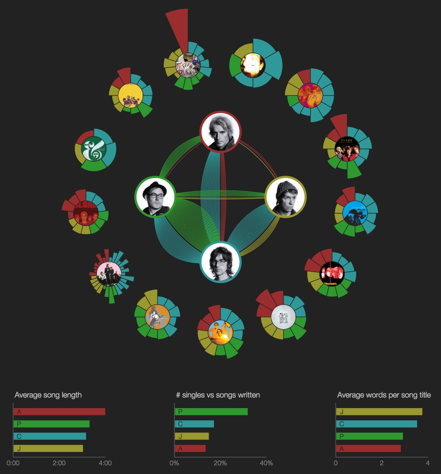
In the interactive version, you can roll over songs, albums, and band members to help visualize all the relationships. For now, it’s best viewed on a desktop or laptop computer; it sort of works on the iPad, but that’s a project for another day. It covers all 13 proper LPs and EPs. Bonus tracks, b-sides, singles: not included. (Again, maybe another day.)
[Update 2016.4.14: That day arrived; b-sides and rarities are now included, as are outtakes from the box sets. Some new charts were added, too.]
The pie slices are color-coded according to the primary songwriter and/or lead vocalist. The length of each pie slice corresponds to the length of the song. The lines between band members indicate backing vocals and/or co-writing credits. For example, a green line from Patrick to Chris means that Patrick sang backup on a song for which Chris sang lead.
Note that the band is notoriously democratic, which mean most songs are listed in the liner notes as being written and performed by Sloan, and sometimes it’s not clear cut whether it’s, say, a Jay song or a Chris song or whatever, and the band probably prefers it that way. Sometimes it’s obvious who the primary songwriter was, but it’s not always as easy figuring out who provides backing vocals. I’m sure I made mistakes, so feel free to send in any corrections and I’ll fix things up.
I think it’s interesting to see how their democracy has evolved over time. The data makes it look like it was the Chris Murphy Show in the early days, but within a few years the per-album workload became pretty even, and the amount of collaboration has continued to rise. Any asymmetry evidenced in these charts only tells a small portion of the story; Sloan is one of those bands that’s always been way more than the sum of its parts.
Anyway, enough talk. Poke around and draw your own conclusions.